Case Study:
How Shanti Project Leveled Up Their GivingTuesday Campaign Page With GiveDirect Fundraising Tools
Published: November 21, 2022
Charity:
The Shanti ProjectMission:
Based in San Francisco, Shanti Project builds human connections to reduce isolation, enhance health and well-being, and improve quality of life for people facing systemic inequities and barriers to care. Shanti provides compassionate care, connection, and critical safety net resources.The Opportunity
GivingTuesday is a great opportunity for nonprofits to see a greater yield in year-end giving. As part of your campaign strategy, take this opportunity to review your website's fundraising pages to ensure you are using all of the fundraising tools that GiveDirect offers. Or, better yet, add a separate GivingTuesday page.
Shanti Project's Solution:
That's exactly what Shanti Project did. They created an outstanding GivingTuesday campaign page with several key elements of good design. Let's see what makes this page special.
-
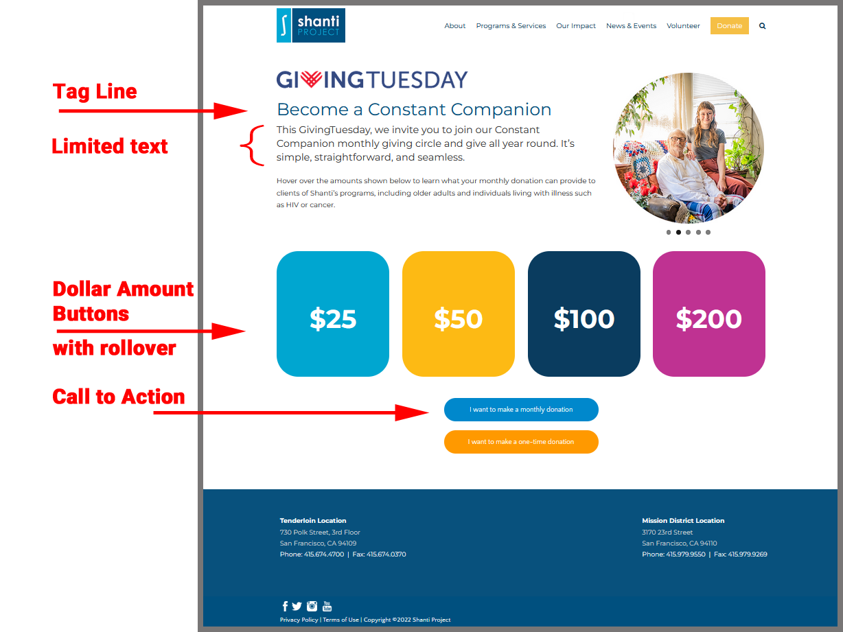
Simple Design. The page has a clean, simple, and easy to read design. As you scroll over the page you find more complex and unique features: rotating images in the header section and hover effects under the suggested amount buttons.
The simple design offers plenty of white space which is important so the eye does not become confused as to where to go next.
-
A great tag line, "Become a Constant Companion," to communicate the nonprofit's message in just a few words.
-
Limited text. The "purpose" text is not overbearing or verbose, making it easy to quickly read.
-
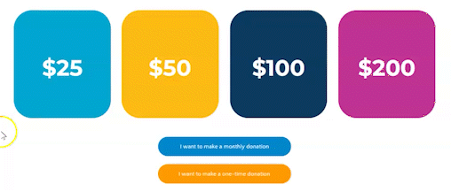
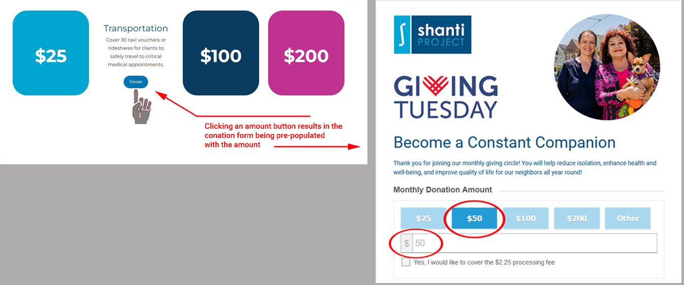
Suggested amount buttons that reveal fund impact statements for each amount. (i.e. under the $200 button is an impact statement for Holistic Care).
-
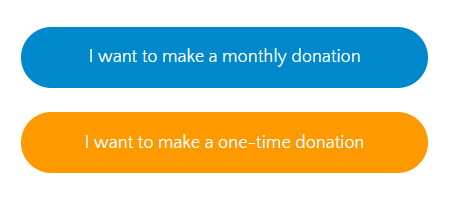
Clear Call to Action. Two donate now buttons for a donor to choose whether to become a monthly donor or make a one-time donation.
Donors who click on the monthly donation button in this GivingTuesday form are routed to a dedicated Monthly Donor form. This recurring payment form is just one of the form templates available with our platform. For more information about how to set up your own Monthly Donor form, email GiveDirect Support or call 866-459-6420.
-
Use of Color. It has been proven that color can affect our mood, emotions and actions. Color has power, both consciously and unconsciously. Use it to your advantage to visually stimulate your donor into action.
For more information about how color may affect a reader's decision, read our GivingTuesday article "What Is Your Call To Action?"
-
In addition to all the great design features included in Shanti's GivingTuesday landing page, Shanti has taken advantage of the GiveDirect pre-population feature for the amount selection. By using this feature, when a donor clicks on one of the amount buttons on the landing page, the donation form is pre-populated with the amount.
For more information about the pre-population feature, read our Help Guide section on "How to Pre-Populate Your Form."
Building a great campaign landing page
Let's review some of the key elements and design tips for creating an effective Campaign Landing Page.
Simple design: Clean, easy to read and plenty of white space so the eye has a place to rest.
Urgent or compelling Headline: Create a tagline/headline that will quickly define the mission and goal of the campaign. People are busy and will only read a few words of what you've written, so keep it short, catchy and concise.
Impact Statements: Highlight the impact a donor can make with their contribution or what you hope to accomplish with all funds collected through the campaign.
Add an engaging banner image. Images, photos, graphics or videos are not just to make your page look pretty. People remember more of what they see than of what they read. Choose good quality images relevant to your campaign that focus on one or two subjects without background clutter.
Offer suggested giving amounts: Giving your donor a frame of reference when deciding how much to give may simplify the decision-making process and lead to larger donations. You can further encourage your donor by highlighting what each amount will fund either through list or a roll-over feature like Shanti used.
-
Include a fundraising thermometer: Use a fundraising progress bar to create excitement as donors see the progress bar tick closer to its target. The progress bar will also serve as a motivator for donors who want to help you reach your goal. Make sure to also include a report of campaign progress in your social media posts
For more information about the GiveDirect Fundraising Progress Bar, please read the Help Guide section "Adding a Progress Bar to Your Payment Form."
Make it mobile friendly: These days it is imperative that your design be mobile friendly. According to leading market and consumer data companies, approximately 72% of the U.S. population use smartphones. Keeping your page simple will aid your mobile user to navigate the page. Also, ask a friend or colleague to preview your site on a smartphone or tablet and run through the donor experience. If the friend/colleague has trouble reading the text or finding your Call To Action, so will your audience.
Set your GivingTuesday page as the home page: On this big day, you want your GivingTuesday page to be the first thing your visitors see. Make it as easy as possible for them to donate to your cause.
In Conclusion
As you design your landing page, incorporate only those design features that work for your campaign. While these are all good suggestions, you may not need all of them on a single campaign page.
- Example: You are running a long-term campaign to raise money for a building project, you may not want to include a progress bar. On the other hand, if your long-term campaign is broken up into small segments, say $10,000 for playground equipment or you want to raise $50,000 in five days, a progress bar would be beneficial to encourage increased giving to reach the short-term goal.
- Example: Outside of GivingTuesday, it may not be appropriate to make the campaign page as your landing page.
Use your discretion when deciding which elements and fundraising tools to include in your campaign page. Use as many of the features as is practical, but don't feel that you must use all of them.